Adding notification elements to your theme
In this post we explore how to add different types of notification elements to your theme in a way that makes them easy to maintain in the future.
A common requirement for custom help center themes is to be able to display notifications on one or more pages. We’ll follow a similar approach to the one described in this post but with an emphasis on how to customize the look-and-feel of the resulting notification using our theming framework.
The best practice recommendations made in this post will ensure that your notification looks great, is easy to update and supports multiple languages.
All of our themes now include a built-in notification banner that you can customize using theme setting. This post remains for information purposes only.
Define the notification content
We recommend using Dynamic Content to store the content of your notification. Benefits of this approach include:
- Agents with the ability to edit dynamic content can edit notification content from within Zendesk Support, without requiring access to Zendesk Guide or the theme code.
- Notification content can be easily translated, allowing your notification to be displayed in multiple languages.
To create a new Dynamic Content snippet:
- Log into Zendesk Support
- Navigate to Admin > Manage > Dynamic Content
- Click on the Add Item link
The content itself can contain HTML, allowing for both headings and text to be displayed:
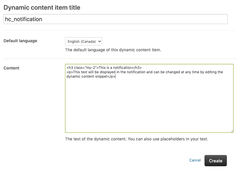
The dynamic content snippet should only be created once, unless you have multiple, independent notifications to display. When the snippet is created you will be presented with a placeholder based on the title entered. For example, the content snippet shown above results in a placeholder of {{dc.hc_notification}}.
If you don’t want the notification to appear in your help center, simply add # to the start of the snippet.
Update the page template(s)
Once you have defined your notification content, you can add the custom notification markup to one or more of your theme page templates. The choice of template will depend on where you want your notification to be displayed:
If your notification should only appear on the Home page, update the home_page.hbs template. Alternativelt, if your notification should appear on all pages, the header.hbs template would be a good choice.
The notification style examples that follow are all created using combinations of our background color, text color, border and position utilities. They highlight how easy it is to change the look-and-feel of an element using a few class names.
Inline style
Inline notifications are an example of a style of notification you can display:
<div class="alert hidden p-5 bg-red-100 border-left border-left-4 border-red-500 border-radius">
  {{dc.hc_notification}}
</div>
Importantly, the notification should be hidden by default using a class name. In this example, .hidden is used. To allow us to target the element later, we’ve also added an arbitrary class name of .alert which does not conflict with the default .notification styles provided by Zendesk.
Fixed bar
You can also create fixed notification bars, which is full-width and will sit at the top of the page:
<div class="alert hidden media align-items-baseline fixed top-0 left-0 w-full p-5 bg-red-100 text-red-500 border border-red-300">
  <svg class="svg-icon mr-4 font-size-2xl text-red-700 fill-current" viewBox="0 0 24 24" xmlns="http://www.w3.org/2000/svg">
    <g stroke="none" stroke-width="1" fill-rule="evenodd">
      <rect opacity="0" x="0" y="0" width="24" height="24"></rect>
      <circle opacity="0.3" cx="12" cy="12" r="10"></circle>
      <rect x="11" y="7" width="2" height="8" rx="1"></rect>
      <rect x="11" y="16" width="2" height="2" rx="1"></rect>
    </g>
  </svg>
  <div class="media-body">
    {{dc.hc_notification}}
  </div>
</div>
These are just a couple of the countless possibilities that exist. Because they are created using a small set of utility classes, you can easily customize them to meet your requirements.
Add the JavaScript
Because each notification has a class name of .alert and is hidden using the .hidden class, we can use the following code to reveal the notification on page load if there’s notification text to display:
(function() {
  document.addEventListener('DOMContentLoaded', function() {
    var alerts = document.querySelectorAll('.alert');

    // Reveal each notification if the content doesn't start with "#"
    Array.prototype.forEach.call(alerts, function(el) {
      var text = el.innerText.trim().substring(0,1);
      if (text !== '#') {
        el.classList.remove('hidden');
      }
    });
  });
});
The script is self contained, so you can copy and paste it above or below any existing code in your script.js file.
Updated on 21 December 2021
Ready to get started?
Take your Zendesk help center to the next level with our easy-to-customize themes.