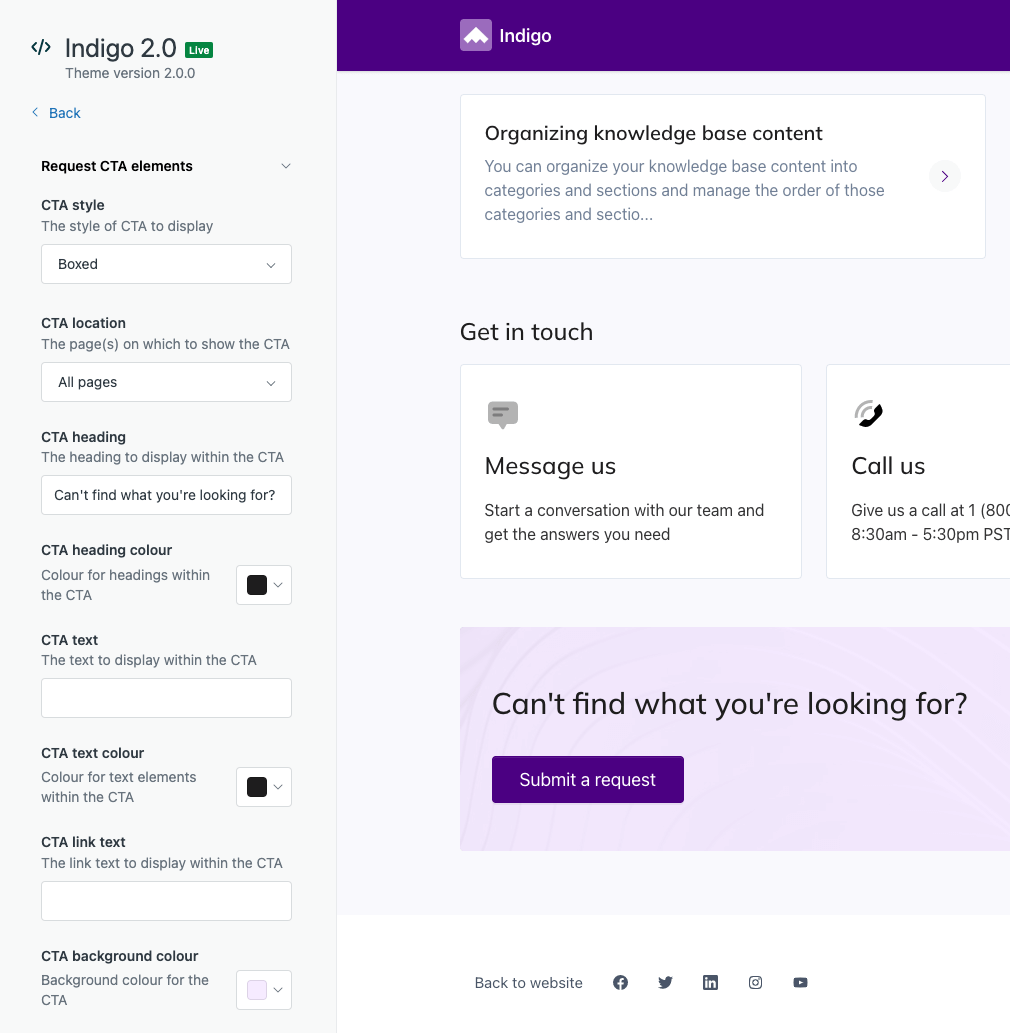
A common action taken by end-users is to submit a new request through the help center. Our themes allow you to display and configure a call-to-action section using theme settings. The content and overall style is fully configurable and you can even use styles from other themes or our pattern library.
Adding a call-to-action
Each theme has a slightly different set of call-to-action styles, but they’re all built upon the same set of configurable properties.

| Setting | Description |
|---|---|
| CTA style | The style of CTA to display. |
| CTA location | The page(s) on which to display the CTA. |
| CTA heading | The heading text to display within the CTA. |
| CTA text | The optional body text to display within the CTA. |
| CTA link text | The link text to display within the CTA. |
| CTA heading color | Color for text elements within the CTA. |
| CTA color | Color for text elements within the CTA. |
| CTA background color | Background color for the CTA. |
The image that’s used in some layouts as a background or inline image can be configured using the CTA image setting within the Images setting group.